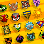
 A Look At Altador Cup Team Logos And Colors
by pikachu315111
--------
A loyal Altador Cup veteran needs not to think which team they'll be joining for the Altador Cup. As soon as the news announces the start of the Altador Cup season they rush to Altador's Colosseum, go to Team Profiles, and click on their team's logo and joins them. It doesn't even take a second for them to figure out which logo is theirs, a quick glimpse and they immediately spot their team's logo shape and colors (except the times when teams couldn't attend the Altador Cup or when Faerieland changed their colors post-Faeries' Ruin, but users quickly figure out what has happened and adapt).This is not by coincidence; each team makes their logo unique so that loyal fans can do just as I described above. But have you ever wondered what went into making a team's logo? Why they chose the design that they use? Why they chose the colors that they use? What politics go into it and is there or has there ever been opposition to the current logo and colors? Well, here is the inside scoop on how your and all the other team's logo and colors came to be: Team: Altador Colors: Orange & Yellow
Logo: "Altador Sun" with a rolled-up Fire Yooyu in the center. 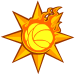
Creation Details:
"We knew from the start that we had to use the 'Altador Sun'," says "Trapper" Remis, Center Forward and Captain of Team Altador. "The question was whether we were going to add anything else." The "Altador Sun" is one of the most recognizable symbols in Altador, and probably in all of Neopia. So naturally it was going to be the basis of Team Altador's Logo, but what about the Fire Yooyu? Remis answers: "We decided that since the Altador Cup is hosted in Altador, we did need to add something to the logo or else it'll blend in with all the other 'Altador Suns'. We chose a Fire Yooyu since at the time it was being used as the poster Yooyu of the Altador Cup because the Normal Yooyu wasn't ready to make its playing debut in the first Altador Cup." Remis also said they don't plan on changing the logo since they really like how the Fire Yooyu plays off the "Altador Sun", looking like a solar flare. "We also like to compare ourselves to a Fire Yooyu," Remis said with a chuckle, "since we're very quick and fast to score!" As for the team's colors? "They came with the 'Altador Sun' pretty much," Remis says with a shrug. One could also point out that Altador is considered a "golden city" and the closest basic colors to gold are yellow and orange. Team: Brightvale Colors: Yellow & Green
Logo: Yellow framed green and white triangle shield with a "Brightvale Star" on it. 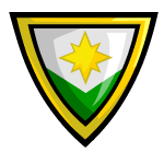
Creation Details:
"We knew our logo would be a shield with the 'Brightvale Star'," says Montecito, Right Defender and current Captain of Team Brightvale. "The problem was what the design of the shield would be and where the star would be put." Shields are used as heraldry symbols in worlds like Brightvale and Meridell, so naturally both teams use a heraldry shield as their logo depicting their colors and symbol. "We must have gone through hundreds of design before settling on the one we use now," says Montecito, "but even though we had a committee of scholars and artists work on it there's still complaints. They say the logo doesn't have enough green and I guess I can see where they're coming from, but the green isn't covered up unlike the white which is where the 'Brightvale Star' is. The star would have clashed with the green so the design made sure the star didn't overlap it." Speaking of color, Montecito mentions it was a bit of a debate what their team colors would be. "Obviously green was going to be one color, but white and yellow are also prominent in Brightvale centric works and we could only pick one. Eventually we decided on yellow since that's the color of the 'Brightvale Star'. Neopians complain our colors and Mystery Island's colors are too much alike, but I ask why should we be the ones to change our colors? I haven't heard them complain, but if Mystery Island has a problem with us using green and yellow then THEY can change their colors!" Team: Darigan Citadel Colors: Purple & Black
Logo: Spiky black framed black silhouette of the Darigan Citadel with a purple-to-red gradient sky. 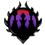
Creation Details:
"When your world is already a floating symbol of dominance," says Layton Vickles, Left Forward and Captain of Team Darigan Citadel, "why wouldn't we want our logo to show that same dominance? The only question was how much detail we wanted to include." Darigan Citadel has dozens of spire towers so most designs look the same except having different amount of towers. Vickles continues, "As I recall, the number of towers never went above five though there was one which featured seven. Some were also asymmetrical and a few didn't include Lord Darigan's tower but those designs were quickly rejected." The center tower in the logo represents the tower where Lord Darigan's chamber resides and thus considered one of, if not THE most important tower. "There's another design of our current logo where Lord Darigan's tower is the highest, however that gave the impression the tower was holding up the frame thus giving more emphasis on the towers beside it. We swapped the heights and now the side towers, though now higher, look like they're the ones supporting the frame and Lord Darigan's tower is given center attention," Vickles mentions. Choosing their colors wasn't as complicated. "Most Darigans are purple and black; it was only natural," says Vickles. "Red was mentioned once instead of black, but it was rejected as we didn't want to share any colors with Meridell." Team: Faerieland Colors: Pre Faeries' Ruin: Lavender & Pink
Post Faeries' Ruin: Dark Green & Dark Pink
Logo: Pre Faeries' Ruin: Pink framed purple tower shield with a pair of stylized lavender-outlined pink Faerie wings on it and a lavender framed pink diamond in the center with four purple spikes going up, down, left, and right coming off it. Post Faeries' Ruin: Green framed dark green tower shield with a pair of stylized pink-outlined dark pink Faerie wings on it and a dark green framed dark pink diamond in the center with four dark pink spikes going up, down, left, and right coming off it. 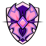 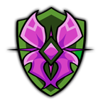
Creation Details:
"We had SO many possible designs," says Kakoni Worrill, Right Forward and Captain of Team Faerieland, "though you could separate them into either being in the shape of Faerieland or a pair of Faerie wings. There were lots of discussion, though to sum it up we decided to go with Faerie wings as all the Faerieland designs was just a city with a tall tower on a cloud, nothing that was specifically 'Faerie'." Faerie wings have essentially been used as an all around symbol to signify what you're looking at is related to the Faeries in some way. Worrill continues, "In the end I guess it was a good call; changing around that logo to match Faerieland's current state would have involve more than changing the colors around if we went with the city design." Though that still doesn't explain the diamond and spikes in the center of the logo. "The diamond is there because the wings didn't look right just coming together at the end, they looked like they were just floating there so multiple designs attached them to several things until settling on a plain diamond," Worrill explains. "As for the spikes, there was a concern no one would take Faerieland as a serious or tough challenge so we added spikes to give the logo a bit of an edge. If you ask me, it's a bit silly, but after so many years playing under its banner I can't imagine our logo without the spikes." Colors originally weren't any more complicated, that was until the fall of Faerieland. "Originally the colors were just a reference to Queen Fyora," Worrill recalls, "but after Faerieland fell we decided to exchange lavender with dark green as to symbolize us taking the situation we're now in an adapting it into our own. Us making the pink a darker tone was done to also show we've become more serious and to better match the dark green. You can say Faerieland may be at its lowest point, literally, but that won't stop it from coming back up stronger and the same can be said about us!" Controversy:
Of course not everyone agreed with the palette change. "The color change only serves us as a reminder of how far we've fallen," says an Air Faerie whose part of a lobby group known as "Skies Below Faerieland". "To many the original colors held secondary meaning than being a reference to Queen Fyora's wardrobe. The lavender was related to the skies and/or clouds which Faerieland used to rest upon and the pink was representative of all the Faerie magic since Queen Fyora's magic is the strongest. Changing the 'lavender sky' with 'dark green earth' is insulting and inconsiderate to Faeries who lost a lot in the fall. And the darkening of the pink could be mistaken as being Faerie magic having become 'corrupted' or 'soiled' when it's just a bit weaker and that's all. Finally Faerieland will be going back into the sky one day so what, we would be switching back to the old logo uniforms when we do? There was no point in changing it!" However Worrill disagrees with the claims. "We represent Faerieland and, at the moment, the old logo and uniforms wasn't a representation of Faerieland. Of course we'll switch back to the old logo and uniforms when we get back into the skies, but until then we want to represent Faerieland as best as we can. Though we are thinking of keeping the dark pink as to us it represents Faerieland toughening up, but we'll cross that bridge when it comes."
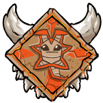
Team: Haunted Woods Colors: Orange & Black
Logo: Triangular orange "vampire" face with black glaring eyes, black frowning zigzag mouth, and black rounded triangle hair (which cuts into the top of the triangular orange face giving it pointy "ears") on top of a orange-and-black striped, pointed standing collar. 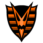
Creation Details:
"YES, it's supposed to be a vampire," sighs Krell Vitor, Left Defender and Captain of Team Haunted Woods, "NOT a pharaoh cobra!" For years there has been much debate about what Team Haunted Woods logo was. A few rightly assumed it was a vampire, many others just shrugging it off as some kind of monster, and then there are those who joked it was a cobra like you'd see on a pharaoh's crown. "I'll admit I never saw a vampire wearing a striped standing collar before, but does the stripe design really throw that many Neopians off?" Vitor asks. His question was met with a question regarding the creation details behind the logo. "We wanted a monster to be the logo of the Haunted Woods, against the objections of the Brain Tree and Esophagor who believed they should be the logo. So we had a ghost design, a witch design, a zombie design, a Werelupe design, which was my favorite, until finally settling on a vampire design as it looked the fiercest with the sharp angles." However, the logo picked didn't have the color scheme as it does now, as Vitor reveals. "Originally the logo had a white face, black hair and mouth, and red eyes and standing collar; however, then we realized that didn't match our colors. Halloween's colors are orange and black, so a redesign was needed to add those colors to our logo. The chosen design is the one we have now, only thing staying the same was the black hair and mouth. We got rid of all the red and white and filled it in with either orange or black." Though normally a hard world to get the approval of residents, most of the Haunted Woods liked the design nicknaming it the "Halloween Vampire". Vitor's voice then starts sounding annoyed again. "And then it was displayed at the Altador Cup and ever since then we've been in a never ending battle to convince Neopians it's not a snake. You'd think being the first team to win the Altador Cup since its hiatus would get Neopians to get their facts about us right!"
Team: Kiko Lake Colors: Dark Green & Brown
Logo: Green framed checkered Kiko's face with top left & bottom right colored black, top right colored dark green, bottom left colored brown with "determined" green iris eyes, 6 small appropriately colored spikes around the perimeter pointing left, right, and all four diagonal directions, and a black curly piece of hair on top. 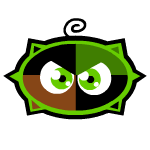
Creation Details:
"The funny thing about our logo," says "Poke" Cellers, Left Defender and Captain of Team Kiko Lake, "is that we were up for any design for our logo. The thing is, every submitted design was in some way a Kiko's face or body." A Kiko's face or even entire body is sort of the unofficial symbol of Kiko Lake. All the buildings in Kiko Lake are shaped like a Kiko, the only furniture they sell that isn't made of seaweed or shells is Kiko shaped, many of the treats they sell are Kiko shaped, and their icon for the Explore map and Games Room is one of their Kiko shaped buildings. "And contrary to popular belief," Cellers continues, "Kiko Lake's population isn't entirely made up of Kikos, there are other mostly aquatic species like Peophins, Jetsams, Flotsams, and Acaras. So the fact even other species agreed Kiko Lake's logo should be in a shape of a Kiko was very telling our logo would be Kiko shaped. The winner was designed by a local weapon maker, hence the glaring eyes and spikes which gives us a fierce appearance. Originally the face was half dark green and half brown, but we decide that looked too plain so we quartered it and made two opposite corners black." That goes right into colors and that's a WHOLE other story, as Cellers will tell. "Official colors were actually chosen before we finalized the designs. Many expected us to pick blue because we're a lake, but our lake is so crystal clear that you can see the bottom so we decided that didn't really make sense. We chose dark green to represent the lush green forest around us and brown for the color of wet sand which is the only way we could represent the lake."
Controversy:
Some groups don't agree with the colors chosen. "I can understand where they were going with not wanting to use blue because Kiko Lake is crystal clear," said the head of the Lake Conservation League, "but the colors they chose are bringing out a wrong impression! Neopians are thinking the dark green and brown IS referencing our lake so those who don't know much about Kiko Lake think it looks like a swamp! It's dirtying our world's and even species' reputation. Blue is just the designated color to water so there's no harm in using that instead of brown. I also wouldn't mind a brighter green but my main goal is changing the brown for blue." What does Cellers have to say about this? "We made a logo with blue instead of brown but it didn't look right, so the brown is staying." Team: Krawk Island Colors: Crimson & Black
Logo: Gray framed crimson-and-black striped tattered flag with a "Jolly Roger" that's a Krawk skull with a slight cranium crack and crossbones behind it. 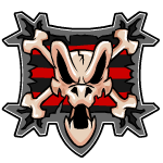
Creation Details:
"The Krawk skull 'Jolly Roger' has been around since I was a lad," says Garven Hale, Goalie and current Captain of Team Krawk Island. "However, it usually be a crudely drawn thing." You'd be hard pressed to find one of these crudely drawn Krawk skull "Jolly Rogers"; all pirate ships have their own customized flags and a few aren't the traditional "Jolly Roger" skull and crossbones. Hale spins a yarn. "Under normal circumstances a pirate sails under the name of the'r own, the'r ship, and the'r crew. However the'r be times when a pirate may also sail under the name of Krawk Island if they be somewhat patriotic and feel Krawk Island had been insulted by the'r target. They would usually take a tatter'd piece of clothing, usually a swabbie's striped shirt, draw a Krawk skull 'Jolly Roger' and raise it up with the'r flag. Our logo be prob'ly the first time the Krawk skull 'Jolly Roger' be used as an official symbol and very nicely drawn." Their colors also come from the Krawk skull "Jolly Roger" tale. "Remember I sa'd that a swabbie's tatter'd striped shirt usually be used to make the flag? Jus' as our logo shows, the'r shirt usually be striped blood red and plague black. It officially be 'crimson' and plain 'black' because the Altador Cup Committee be lily-livered pansies," remarked Hale.
Team: Kreludor Colors: Orange & Purple
Logo: Orange-and-purple striped military-like badge with 3 orange stars and 2 purple stars patterned on top and a Kreludor surface-designed rolled-up Yooyu in the center. 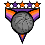
Creation Details:
"The logo doesn't mean much unless you know about Kreludor's history," says Qlydae Wegg, Team Kreludor's Left Forward, "especially the history of the Kreludor Civil War." The Kreludor Civil War was a conflict between the Orange and Purple Grundos with both sides being led by brothers, Xarthab for the Orange Grundos and Zorlix for the Purple Grundos. The civil war was going on during the first few Altador Cups until the Return of Sloth Plot revealed that Dr. Sloth was perpetuating the war. Dr. Sloth kept the brother and their armies, both once a single rebel force fighting against him, busy fighting so they didn't stop his mining operations on Kreludor. Once the scheme was revealed, the two brothers made peace with each other and joined The Resistance in foiling another of Dr. Sloth's Neopia takeover attempts. "The logo is based off a medal of honor both sides gave," Wegg explains. "The original medals were mono colored and had a emblem of Kreludor on it, but when it was decided it would be the logo for Team Kreludor we made it orange & purple and replaced the Kreludor emblem with a Yooyu to clearly show its different from the military medal." As for the colors, I think it's apparent where they came from.
Controversy:
Veteran soldiers of the Kreludor Civil War are outraged Team Kreludor used a medal of honor for their logo. "They're disrespecting all the Grundos who fought and gave their lives in the war," said a Purple Grundo veteran. "I have a medal of honor for the Purple side, I have friends who have one, and I knew others who are no longer with us that earned theirs upon their passing." The veteran stopping for a moment in silence before continuing. "Just seeing the medal not only used for a game but also changed to be both purple and orange is upsetting. They didn't even do a good job, why are three of the star orange yet two are purple? Why is the orange "v" on top of the purple? There were plenty of symbols they could have used; now whenever a young one sees a real medal they think it's for Yooyuball! Makes me so angry." When Weggs was asked about this, he looked uncomfortable while answering. "We meant no disrespect; we wanted to honor Kreludor and the soldiers of the civil war. As for the color imbalance, because the Altador Cup took place while the civil war was still going on there was some sway. The committee had Orange Grundos members who, though they wanted peace between all Grundos, thought the Purple Grundos were the aggressors so gave orange more stars and their 'v' stripes on top, but they did include a extra bit of purple between the starts and Yooyu to make up for it. Later Zorlix would admit to a Kreludor court after Sloth's recent scheme that his side was the aggressors, so one of the punishments decided was to keep the Team Kreludor logo more 'orange dominant'."
Team: Lost Desert Colors: Blue & Yellow
Logo: Yellow-and-black framed blue-and-yellow striped hanging triangle banner with a tan-and-brown layered pyramid on it. 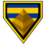
Creation Details:
"The thing about the Lost Desert," begins Leera Heggle, Goalie and Captain of Team Lost Desert, "is that it's not a single unified nation but a sprawling desert spotted with many city states. 'Team Lost Desert' is actually more like 'Team Sakhmet'; I don't know any player or trainee who isn't from Sakhmet." Lost Desert's history isn't a peaceful one. Though the kingdom of Sakhmet had enjoyed relative peace since its introduction to the rest of Neopia, there are many lesser kingdoms in the outer regions which are constantly at war. Kingdoms form and fall over night; there's no point in trying to map it out. The only other Lost Desert kingdom to escape this fate is Qasala, though it itself has been gone for two hundred years. "There was a big debate of just using the Crest of Sakhmet as our logo," Heggle recalls, "but it was decided that if somehow another desert kingdom was to get its footing then having a unified Yooyuball team could be a good way to form relations. I don't know about that. I don't get into politics." Heggle shrugged before continuing. "So the logo. The only thing constant about the Lost Desert are the Gebmids so we decided to use them. From there we only needed to know the team colors to design the rest of the logo." So, how were the colors chosen? According to Heggle, "The Lost Desert is very yellow so that color was a give-in. As for blue, it was chosen because yellow and blue are the colors of King Coltzan III's crown, so it chosen in his honor."
Rumor:
There's a rumor going around that Jazan is trying to form him own Yooyuball team, a Team Qasala. Though like many things involving Qasala, if it's true it's being kept very secretive and no officials are saying anything. We asked Heggle what he thinks about the rumors. "Wouldn't surprise me, it's no secret that Sakhmet's and Qasala's relationship is shaky; some say King Jazan wouldn't have anything to do with Sakhmet if Queen Nabile wasn't from here. I don't know. As I said I don't get involved in politics. What I do know is we did send an invitation to any Qasalan who would like to join Team Lost Desert, but none have responded. Either there are no Qasalan who wants to play Yooyuball or Qasala is secretly building a Yooyuball team. All I know is that if the latter is true there, might be talk of a name change again." Team: Maraqua Colors: Light Brown & Cyan
Logo: Brown framed maractite triangle shield on top of green and yellow seaweed and two groups of four small bubbles in front of it at the top left and bottom right. 
Creation Details:
"We had as many designs as there are shells in the sea," comments Barit Jowes, Right Defender of Team Maraqua, "which is to say a lot. And I'm just talking about choosing the shield. Once we chose to have it be maractite, what rune would be on the shield was an entire design cycle itself! And before you ask, the rune doesn't have a direct translation. It's an ancient symbol that was used by our ancestors to refer to themselves before Maraqua and the term 'Maraquan' existed. There is a maractite rune which means 'Maraquan', but we decided to use the one we did as it would also refer to other aquatic species who didn't choose to become Maraquan. Basically we're using a rune that's supposed to mean we're representing all creatures of the seas and oceans. The seaweed and bubbles were added to give our logo more of a watery feel." Team Maraqua using a maractite shield and rune as their logo isn't surprising but a bit of a mystery are their colors, specifically them using cyan and not a deeper color of blue. "We didn't want to present ourselves as a murky team so we chose a lighter shade of blue and brown," says Jowes, "Cyan also matches the color of the maractite rune and the light brown is meant to represent the ruins of Old Maraqua. Light Brown is the color associated with death and ruin in Maraqua since so many aquatic life turns light brown upon death, so it's a fitting color to remember Old Maraqua with."
Team: Meridell Colors: Blue & Red
Logo: Yellow framed checkered knight shield with blue on the top left & bottom right and red-and-crimson stripes on the top right & bottom left and a 3-pronged yellow crown in the center. 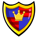
Creation Details:
"What, you mean there isn't a missing wall shield somewhere in Meridell Castle?" jokes "Wizard" Windelle, Centre Forward and Captain of Team Meridell. "Joking aside, there was some discussion on the design of the crown and decided to make the red sections striped," says Windelle, "but our logo is a proud Meridell shield just like those which hang in Meridell Castle. I do recall that it was suggested to use a Yooyu instead of a crown but the shield didn't look right with a Yooyu instead of a crown. Then it was suggested for the Yooyu to wear the crown but we couldn't find a good color for the Yooyu to be as it either stood out or blended too much with one of the main colors. It was decided that you couldn't mess with perfection and the shield was left as it was." This is another world where I don't think it's a mystery why they chose their colors. "By now I believe we have a shade of blue and red named after Meridell," says Windelle with a chuckle. "In fact, we put 'Meridell Blue' and 'Meridell Red' as our official colors, but I think that was just a joke." Team: Moltara Colors: Reddish-Brown & Crimson
Logo: Crimson-to-red gradient frame black volcano with red cracks and an erupting yellowish-orange fiery top with yellow 8-tooth gear cog in the center and 3 teeth of a rusty orange gear cog that the volcano is on top of. 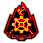
Creation Details:
"There was a lot of pressure for us to make a really good logo," says Aldric Beign, Left Forward and Captain of Team Moltara. "Being the newest team it was very important for us to attract as many supporters as possible. To do that we first needed to hook them in and that's what we needed the logo to do. We chose to try to give our logo a glowing effect, like behind it is a magma flow. That's what gave us the idea to have the body of the logo be a volcano with lava flows and an erupting top. Of course, being it's supposed to represent Moltara, we knew it also needed a few gears. After a few designs, we decided to keep it simple but prominent. We ended up putting one in the center and gave it a glowing effect making it the center of focus and then a side view of one on the bottom of the volcano to give it all a mechanical feel, like we were the ones controlling the volcano." Another interesting trait about Team Moltara is that its team colors are both different shade of one color. "We were about to use a normal or darker brown," recalls Beign, "but then someone pointed out all the other teams used two different colors and we could stand out by using two different shades of the same color. We had already picked Crimson as one of our colors so went for a reddish-brown as our other. Our goal was to make an impression we were a unique team and worth joining. I think we succeeded as we have a loyal following, it's just that other teams have been around longer. But no team has managed to win a second time, which means it's only a matter of time before Moltara to be standing on the highest podium!" Team: Mystery Island Colors: Floral Green & Dark Yellow
Logo: Tiki Tack Man's mask in front of a batch of leaves with two yellow lit tiki torches on either side and flames center top and behind the leaves. 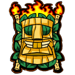
Creation Details:
"Designs were varied but all had a central theme of being based on the island's guardians," remembers Teylor Nix, Left Forward of Team Mystery Island, "Techo Mountain, Jhuidah's Cooking Pot, Tiki Tour JubJub, and, of course, the Tiki Tack Man's mask. As we went through the designs, the Tiki Tack Man's mask became a common inclusion, so we decided to use it as the basis of our logo. Every other part of the logo was to help make the mask stand out and look intimidating." As mentioned with Team Brightvale, Mystery Island's colors are similar to theirs but are a darker shade. "It's been suggested we change the dark yellow with another color, but I don't see the problem." Nix shrugs. "Yeah, the base colors are the same, but I've never heard of anyone confusing us for them. Mystery Island has two main parts: its jungle and its beach. The colors we chose both represent these parts: floral green for the jungle and dark yellow for the beach. If Team Brightvale has a problem with us using these colors, I would like to point out to them that they have a third color in white they can use."
Rumor: There's been several rumors surrounding the use of the Tiki Tack Man's mask. Some say the Tiki Tack Man isn't happy they're using his mask as the Team Mystery Island logo. Others say that the Tiki Tack Man might have paid the design committee to use his mask as free advertisement for his shop and Tombola game. Nix is asked about both rumors. "That's all they are, rumors, false rumors to be exact. We knew we couldn't use the Tiki Tack Man's mask without his permission so we asked him if we could and he was more than happy to, saying it was an honor. Whether there was a hint of him seeing this as an opportunity for free advertisement is another issue, but he didn't do anything to sway the design committee's decision to use his mask until after we decided to use it and he let us. Though I don't see why he would need the free advertisement, all visitors to Mystery Island go straight to play Tombola. He gets more visits than the Training School and Trading Post combine!"
Team: Roo Island Colors: Red & Light Green
Logo: Black framed checked diamond with yellow on top, green on left, blue on right, and on bottom with a silhouette of Blumaroo on it that has a 3-pronged jester crown floating above it (possibly suppose to be King Roo).
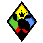
Creation Details:
"King Roo designed the logo with his advisors," says Lilo Blumario, Right Forward and Captain of Team Roo Island. "They didn't start making designs until they knew exactly what they wanted. Because Yooyuball falls within King Roo's field of interest, he's very involved and supportive of us. He personally chose us to be on the team and recruited Jair Tollet and 'Squeaky' Tressif." King Roo had done his best make Roo Island the place to go for gaming, so it's not a surprise he's probably the most involved ruler when it comes to the Altador Cup, probably even more so than any of the Altador Council members. Blumario continues. "King Roo said he wanted the logo to be 'simple yet colorful yet representative'. So him and his advisors chose a simple diamond for its shape, used the four basic colors to make it colorful, and put a silhouette of King Roo to make it representative." Despite having the most colorful logo and uniforms in the Altador Cup, some have questioned their choice of official colors. "Yes, we've heard complaints," Blumario sighed, "Our uniforms can't be taken seriously and our colors contrast negatively. King Roo chose to have us dress like jesters to give us a playful feel and picked our colors because his favorite color is red and on the color wheel the color opposite of red is green. But you know what? You may laugh now, but we're here to have fun and it'll be us who'll be having the last laugh when the Colosseum is decorated with those 'negatively contrasting' colors and us standing on the first place podium in our 'can't be taken seriously' uniforms!" Team: Shenkuu Colors: Yellow & Crimson
Logo: Yellow dragon-face emblem with crimson patches in place of the nose, eyes, snout, and forehead with a pair of black spear blades on either side and a crimson rolled-up Yooyu resting on the bottom of the emblem. 
Creation Details:
"Glad some know our logo is suppose to be a dragon's face," says Mirsha Grelinek, Left Forward and Captain of Team Shenkuu. "We know how Team Haunted Woods feel when Neopians get confused about their logo. Admittedly our logo is a bit more ambiguous if you're just taking a quick glance at it, but to me the nostrils on the bottom is what gives it away. It's supposed to be a face with the shape revealing it's a dragon. We had designs that were more obvious it was a dragon's face once we decided it would be a dragon's face, but it was decided that would limit design details. The result was our logo coming out very fanciful and some say exotic." Their colors have significant cultural meaning. Grelinek explains. "In Shenkuu, red symbolizes happiness and good fortune while yellow symbolizes balance and good luck. Together the colors represent great success, and we wear these colors with pride and respect." Team: Terror Mountain Colors: Cyan & White
Logo: White-and-cyan pattern framed diamond on top of a white-and-cyan pattern framed square (making it look like a snowflake) with a snow topped mountain and white starry/snowy blue to black gradient sky. 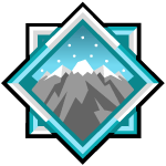
Creation Details:
"Three layers to Terror Mountain means three kinds of designs," remarks Prytariel, Centre Forward and Captain of Team Terror Mountain. "Four kinds of designs if you count ones which were just the mountain, one which we ended up using. Actually we were going to choose an intricate design which showed a mountain where you can see Happy Valley, the Ice Caves, and Terror Mountain's peak layered inside with some well known landmarks visible but we thought that was too much so went simpler. But even then a logo of just a snow topped mountain wasn't that interesting to look at, so we did another design round to choose a frame. We went with a snowflake design and had frames which were two triangles, a triangle and a square, pentagon and square, and two pentagons; but in the end we chose the square and diamond frame and I think it worked out for the best." Though you may be able to guess why Terror Mountain chose the colors they have, they had some more to choose from, according to Prytariel. "The colors we chose represent the two main elements of Terror Mountain: cyan for ice and white for snow. However we had a few others colors we could have chose. We had a few shades of grey, lighter shades were recommended to represent ice while darker shades to represent the mountain's stone. Red and green were submitted because of Terror Mountain's affiliation with the holidays but it wasn't thought that was representative of Terror Mountain. Though, red by itself was suggested as it's the color of the Heart of the Mountain. But we decided to go with the colors that most Neopians see with their eyes and thoughts when they come to Terror Mountain." Team: Tyrannia Colors: Tan & Orange
Logo: A framed tan rocky diamond with 4 orange triangles coming from the corners and pointing to the center with a pair of bony horns on top of the diamond, two rows of teeth on the bottom of the diamond, and a cave drawing of an un-rolled orange-and-tan Yooyu in the center.
Creation Details:
"We wanted to have a strong emblem," says Loryche, Centre Forward and Captain of Team Tyrannia, "so we made one out of stone and bone. We thought about using a stone wheel; however it was argued it went against the chosen theme so it was made into a rigid diamond. The horn and teeth came from long ago slain monsters from the Tyrannian War which many of the designers kept around their homes as mementos." When Tyrannia was first discovered, it was at a brink of a war between the Tyrannians and a giant beast named the Monoceraptor and its army. It was a long battle but the Tyrannians eventually fought the Monoceraptor's forces back and slew it, though it vowed to return one day somehow. Loryche continues. "However, a plain tan stone wasn't anything interesting to look at so we had several cave drawers make designs of what could go on it. The one we chose, an unrolled Yooyu, was made by a cave drawer whose best known to draw Petpets in ways not usually drawn. Finally when orange was chosen as one of our colors we painted orange designs on the stone, mainly outlining the Yooyu and triangles pointing to it." And how were the colors chosen? "We chose our colors based on Tyrannia itself. Tan for the stones which make up the Plateau and orange for the daytime skies," Loryche said. "Altogether they tell you that we are Team Tyrannia and are not a team to be taken lightly!"
Team: Virtupets Colors: Red & Gray
Logo: Shiny, metallic silver sphere with a "Virtupets V" in the center. 
Creation Details:
"Like any project on the Virtupets Space Station," begins Keetra Deile, Right Forward and Captain of Team Virtupets, "we define what we want and its parameters. So for our logo, we wanted something which was representative of the Virtupets Space Station and its parameters where specific features we wanted to include. At first the design was a head-on view of the Virtupets Space Station with emphasis on the 'Virtupets V', but then studies shown that a minimalist design drew in more Neopians as it easy to remember. So we simplified the logo to a 'Virtupets V' on a metallic silver sphere and spent the rest of the design cycle on deciding how the 'Virtupets V' should look. Once all that was done we had a 3D replica of the logo constructed to see how lighting would realistically shine off the metallic silver sphere and the 'Virtupets V' before converting it into a 2D image to be used as our logo." So, got all that? Well if you didn't don't worry, how they got their colors is a bit simpler. "Choosing the team colors was actually done first since it was a very easy project," says Deile. "We were done with it almost as soon as it started. Red for the 'Virtupets V', gray for the metallic silver casing surrounding the Virtupets Space Station. Other colors were suggested like 'Sloth green' from the Sloth Minions or platinum blue from the Neo Metalloid Engineers, but such suggestions only garnered small support. In the end it was decided from the outside the Virtupets Space Station is red and gray, so our colors will be red and gray, thus our logo will be red and gray, because we represent the Virtupets Space Station."
Controversy:
Speaking of Sloth, though the citizens of the Virtupets Space Station has gotten use to seeing the "Virtupets V" as just being the symbol of the station, many Neopians still see it as a symbol representing Dr. Sloth thus should not be used. It's argued that since the Altador Cup is a worldwide event that a symbol that was used by one of Neopia's most notorious villains is insulting to anyone who had been affected by Dr. Sloth's influence be it directly or indirectly. Neopians living on the Virtupets Space Station aren't strangers to these complaints, this includes Deile. "The majority of us living on the Virtupets Space Station have long declared our freedom and separation from Dr. Sloth, it's why his most recent scheme involved him trying to reclaim the Virtupets Space Station. And those who are still loyal to Dr. Sloth like the Sloth Minions do so in secret and identities of their members are never known. We have claimed the Virtupets Space Station as our own, which includes the 'Virtupets V', which the Neopian's Governments agree with. By Neopian law, Dr. Sloth is illegally using the name 'Virtupets' and the 'Virtupets V' for his own ventures. I'm sorry if anyone has been hurt by Dr. Sloth and relates the pain to the 'Virtupets V', but for the residents of the Virtupets Space Station the 'Virtupets V' is a symbol of pride which Team Virtupets are proud to represent!" 18 teams, 18 logos, and 32 colors. Each team took a lot of time and work to make the right logo and choose the right colors, and for the most part it worked out as each logo is well known and can be easily identified upon being seen. So now when you're playing under one of these logos and color pairs this Altador Cup, you can take pride that you know the history behind these symbols of your team!
| |
|
Search the Neopian Times
Great stories!
---------
 The Persecution: Part One The Persecution: Part One
Some people would be very taken aback at learning that vampires openly lived among the mortals, but here in Neovia, it isn't much of a big deal.
by racerfishy |
---------
---------
---------
|
|