 Behind the Emblems
by water_park1993
--------
The exciting time of Altador Cup is fast approaching. As it is a well-known fact, every team in the Altador Cup has their own unique emblem. You can see and recognise them easily, comfortably distinguishing between Roo Island and Darigan. But what inspired the different lands to create their own emblems? Which were the driving factors that make them recognisable to the eyes of a supporter? It might have taken me twelve years but I can finally reveal the scoop behind every emblem!
Altador, the Suns 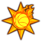 The emblem used by Altador is sun shaped. A fire Yooyu resides in the middle, curled in its Yooyuball form. The sun shape can be found on almost any Altadorian item as well as on the floor of the Hall of Heroes - it was only natural that it would be featured on their emblem. Altador is the first land to receive the light every morning of a new day and, because of the scorching sun, the Suns decided to use their favourite sun shape with a fire Yooyu. Furthermore, since they are the founders of the game it is fair for them to display a Yooyu on their emblem.
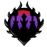
Darigan Citadel, the Minions On the Darigan emblem we can clearly recognise the hovering citadel, where Lord Kass and the other known Neopets reside. The spikes on the logo emphasises the viciousness and ruthlessness of the inhabitants of Darigan Citadel. The dark and moody colours used, Black and Purple, are dominant on this almost circular shape. It can be argued that it resembles the spiky head of a Darigan Darkling. The Minions are very touchy sometimes, especially if they see someone using the Kass basher avatar, therefore be careful; you wouldn’t want to be pierced with their ferocious spikes.
3. Faerieland, the Faeries 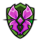 The Faerieland emblem features a pair of purple wings imposed in the middle of a green background. Using the wings is the obvious choice since all of the Faeries as well as all Faerie Neopets bear wings, therefore the Faerieland emblem should have them as well. The shield-shaped emblem has green colours because, once Faerieland fell, it landed on the green plains next to Meridell. Now, whilst the old logo was painted pink to resemble the skies, the new has is painted green to honour these very plains. In the middle of the wings the Faeries decided to put a gem to honour their Queen, Fyora.
4. Haunted Woods, the Zombies  In the he middle of the emblem of the Haunted Woods lies a face which looks like a scarecrow or a generic scary Halloween mask. It is no secret that Halloween is very popular in the Haunted Woods. The shape of the mouth mirrors the mouth of the Brain Tree or the Esophagor, which the Zombies decided to honour. For the more creative, the orange colours of the logo are important since they represent the traditional pumpkin carving which extensively takes place in the Haunted Woods. 5. Kreludor, the Moons 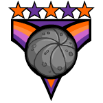 Stars are featured onto the Kreludor emblem which suggest that they are coming from outer space. The Moons have decided to cleverly use a Yooyu in the middle of their emblem, both due to Yooyuball but also to represent their homeland, Kreludor, due to the circular shape of the Yooyu. The use of purple and orange refer back to the invasion of Dr. Sloth and how all purple Neopets used to have orange spots before Parlax took care of the situations.
6. Krawk Island, the Pirates 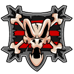 The middle emblem of Krawk Island is shaped after the head of a Krawk. We wouldn't expect otherwise from the (almost) homeland of the Krawks, would we? Continuing as true to their nature, the Pirates used the bones and the stripes to resemble a pirate flag. Also the use red and black is dominant around the whole logo which are colours well-known to be used by pirates. The eyes on the Krawk head look angry to show determination and the mouth is open ready to bite anyone who dares defy them.
7. Shenkuu, the Ninjas 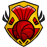 The logo of the Ninjas is highly reminiscent of the wings and sails of the Cyodrake Gaze. The whole concept reminds of an eastern world by the use of the colours yellow and red. The complexity of the logo suggests the way of life of inhabitants of Shenkuu as it refers to the way the land is built; mountain tops, rivers and bridges as interconnects. The colouring of red and yellow can be found on every Shenkuuvian building.
8. Lost Desert, the Mummies 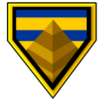 As it is expected, the logo of the Mummies features a pyramid. This is only natural of a desert land as it represents their cultural beliefs. Pyramids are also popular in the Lost Desert through the available games. The colours are in the shade of yellow and brown. These signify the endless hot sand in the Lost Desert as well as the scorching sun in the sky. Looking closely, even the logo’s background has the shape of a pyramid. It is rotated 180 degrees letting the tip of the pyramid to be at the bottom.
9. Maraqua, the Mermaids  The Mermaids decided to have their logo in the shape of a shield. This shows the resistance the Maraquans had against Captain Scarblade years ago, when there was a conflict. Furthermore, the air bubbles scattered around along with sea-grass are reminiscent of the underwater nature of Maraqua. The colours seen are blue, brown and green signifying the colours of water and grass. The contrast of dark blue and light blue found on the logo, can be also found on many Maractite items such as the Reinforced Maractite Shield, an important element for the Maraquans. 10. Meridell, the Knights 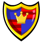 Reminiscent of the Medieval period, the logo of the Knights has the shape of a knight’s shield, as you might have guessed. The middle features a crown, to honour their Grumpy Old King, King Skarl. The main colour scheme of red, blue and yellow reflects the favourite colours of the King; his colour is blue, his robe is red and his medallion and crown are yellow. The colour scheme is featured in many Meridellian items.
11. Mystery Island, the Natives 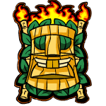 The logo of the Natives shows a wooden mask on the front, to remind us of how exotic the island is. The inhabitants of Mystery Island wanted to honour their Tiki Tack man and used the figure of his head as the main logo. Around the edges we can see much vegetation, which represents the rich flora of the island. As its name insists it's full of mysteries, which is also suggested by the fire at the back of the logo. You surely don't want to get lost there except if you want to experience a once-in-a-lifetime adventure!
12. Roo Island, the Rooligans 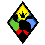 Like true jesters, the logo of Roo Island features all four colours; red, blue, yellow and green. In the middle we can see a Blumaroo, which is the species that originate from this island. On the top of its head, we can see a crown. The Rooligans wanted to pay their respects to King Roo, the great blumaroo King who lives on Roo Island. The shape of the logo is that of a diamond which perfectly reflects their playful nature.
13. Terror Mountain, the Chillers 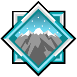 Clearly on the logo of Terror Mountain, we can see the glorious mountain with snow at its peak. The snow reflects the weather on Terror Mountain which is always icy cold and snowy. Not everyone can live under those low temperatures but the Chillers don’t seem to mind as they are trained to keep up at any temperature range. The dominant colours are blue and white which, apart from the snow, they too represent the freshness of the team.
14. Tyrannia, the Fossils 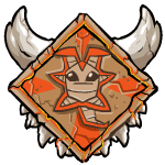 A yooyu couldn't not be part of the logo of the oldest land on Neopia. Rumour has it that, after Altador, Tyrannia was the next land to practice yooyuball. The Tyrannia logo is also made of stone. This was intentional, to show that the Fossils prefer to live in prehistoric ways of life, where stone is very popular. The teeth and horns give the look of the prehistoric era, that included many Grarrls roaming around! The brown and orange colours Reflect the arid land.
15. Virtupets, the Robots 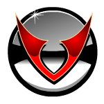 The shape of the logo of Virtupets is the outline Virtupets Space Station, only in a more 2-dimensional point of view. It's like looking at the Space Station from above. The dominant colours of red and gray as well as the metallic look of the logo, remind us of the robotic nature of the Robots and the advanced technology which exists on such a Station.
16. Kiko Lake, the Kikos 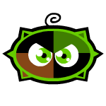 The Kiko Lake logo, like the Roo Island logo, has the shape of a Kiko, since it's the homeland of every bouncy creature in Neopia, the Kiko. The eyes of the Kiko onto the logo which is looking at us look determined to win the Cup, no matter what. The dominant colours are green, black and brown which resemble the main colours of their Lake. Most Kiko Lake items share the same colour scheme
17. Brightvale, the Wizards 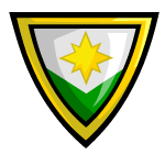 Comparable to the Merdiell logo, the shape of the logo of the Wizards also resembles a shield. The sun that is imprinted in the middle reflects their wisdom and how it will shine onto every Neopian creature, since they are the land of knowledge. The colours they used, green white and yellow, are the favourite colours of their King; King Hagan. He is green, he wears green, his crown and beard is yellow and we can also see some white on him. This logo is modest, to show how much wiser - they think - they are and above all other lands. 18. Moltara, the Magmas 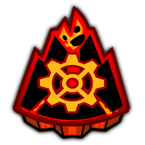 Late comers into the competition with an excellent logo nonetheless. Showing a volcano with magma flowing out, this logo gives us the sense of a city which makes great use of fire and molten rock. This is very fitting for the Magmas, as they inhabit an underground city powered by steam and fire. This is further highlighted by the use of black, orange and red predominantly which remind us of the natural environment there. The cog in the middle shows the use of steampunk machinery. Thus, this concludes my theories behind every Altador Cup logo used by the teams. It cannot be argued that once you see the logo you can easily correlate it to a team due to the unique traits of each land.
|